This module allows the user to flexibly manage combo-box field selection values in Admin and Merchant portals.
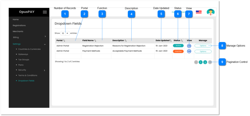
 Number of Records
|
Type
|
Notes
|
Rules
|
Compulsory
|
Format
|
Edit
|
Size
|
Default
|
Error Message
|
|
Combo-Box
|
-
|
1. This should allow the user to select an option to control the number of Field records visible in the grid.
2. Displays following options to select from:
|
-
|
-
|
Y
|
-
|
10
|
-
| |
|
 Portal
|
Type
|
Notes
|
Rules
|
Compulsory
|
Format
|
Edit
|
Size
|
Default
|
Error Message
|
|
Column
|
-
|
1. This should display the Portal name the dropdown list is for i.e. Admin Portal or Merchant Portal.
2. This should be sortable.
|
-
|
-
|
N
|
-
|
-
|
-
| |
|
 Function
|
Type
|
Notes
|
Rules
|
Compulsory
|
Format
|
Edit
|
Size
|
Default
|
Error Message
|
|
Column
|
-
|
1. This should display the dropdown name within a portal.
2. This should be sortable.
|
-
|
-
|
N
|
-
|
-
|
-
| |
|
 Description
|
Type
|
Notes
|
Rules
|
Compulsory
|
Format
|
Edit
|
Size
|
Default
|
Error Message
|
|
Column
|
-
|
1. This should display the description of dropdown.
2. This should be sortable.
|
-
|
-
|
N
|
-
|
-
|
-
| |
|
 Date Updated
|
Type
|
Notes
|
Rules
|
Compulsory
|
Format
|
Edit
|
Size
|
Default
|
Error Message
|
|
Column
|
-
|
1. This should display the date the dropdown was last updated.
2. This should be sortable.
|
-
|
-
|
N
|
-
|
-
|
-
| |
|
 Status
|
Type
|
Notes
|
Rules
|
Compulsory
|
Format
|
Edit
|
Size
|
Default
|
Error Message
|
|
Column
|
-
|
1. This should display the status of the dropdown (Active or Inactive). If the dropdown is Active, it is available to users.
2. This should be sortable.
|
-
|
-
|
N
|
-
|
-
|
-
| |
|
 View
|
Type
|
Notes
|
Rules
|
Compulsory
|
Format
|
Edit
|
Size
|
Default
|
Error Message
|
|
Button
|
-
|
1. This should allow the user to view a list of available options within the dropdown. Refer to the specification for that screen here.
|
-
|
-
|
Y
|
-
|
-
|
-
| |
|
 Manage Options
|
Type
|
Notes
|
Rules
|
Compulsory
|
Format
|
Edit
|
Size
|
Default
|
Error Message
|
|
Button
|
-
|
1. This should allow the user to view and edit the list of available options within the dropdown. Refer to the specification for that screen here.
|
-
|
-
|
Y
|
-
|
-
|
-
| |
|
 Pagination Control
|
Type
|
Notes
|
Rules
|
Compulsory
|
Format
|
Edit
|
Size
|
Default
|
Error Message
|
|
Button
|
-
|
1. This should allow the users to paginate through the grid records.
2. To determine the number of pagination buttons to display please follow the current logic that is being used in byondcloud.
|
-
|
-
|
-
|
-
|
-
|
-
| |
|