When the customisation is doing, same customisation need to be reflected on the widget left side at the same time.
If the user clicks the back button and Save button then it should be directed to where it came from.
If the user comes to the customise Widget screen from the Add QR Payment Program, then it this screen is backed/ saved, then the user will be directed to the Add QR Payment Program.
If the user comes to the customise Widget screen from the Edit QR Payment Program, then it this screen is backed/ saved, then the user will be directed to the Edit QR Payment Program.
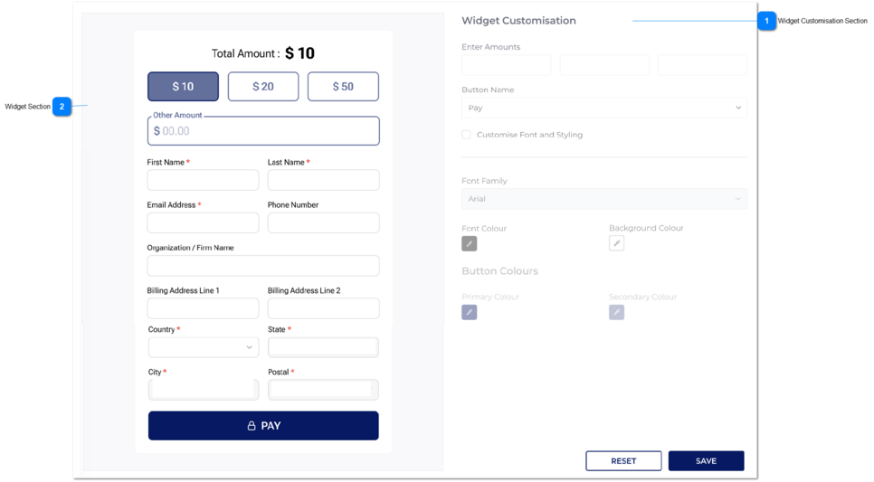
Widget Customisation Section
Type
Notes
Rules
Compulsory
Format
Edit
Size
Default
Error Message
This section allows the user to customise the widget.
text-boxes
Enter Amounts
1. There will be three fields under the 'Amounts.' and those three are mandatory.
2. The user can type and give the values for 3 fields.
4. System allows to type only INTEGER values for the fields.(Other values cannot be entered through the keyboard - Decimal numbers are not allowed.)
5. Minimum value should be 5 for these text-boxes. If the user enters a value less than 5, then validation message will show up.
5A. Maximum number of digits can be entered for amount fields is 4, therefore maximum amount can be 9999.
6. Same amount cannot be repeated.
7. The amount fields should be saved to database in ascending order when adding the QR program. Also, In ascending order the amount will be displayed in the widget.
Yes
NULL(--)
1. Please enter amounts.
5. These values should be greater than or equal to 5.
5A. These values should be less than or equal to 9999.
6. All values must be unique. Please try different value.
Drop-down
Button Name
1. The user needs to select the button name.
2. There are two option for the button name:
Pay
Donate
Y
Select button name
Check-box
Customise Font and Styling
Once the user checks the box, then the below will be enable for editing.
Font Style
Background Colour
Font Colour
Button Colors
N
Drop-down
Font family
There are font styles as a list for the drop-down, the user can select anyone from that.
By default the font family should be Montserrat.
Color - Picker
Font Colour
By default the Background Colour should be balck.
The user can select a colour from here. (This color will apply to the Total Amount heading)
Color - Picker
Background Colour
By default the Background Colour should be white.
The user can select a colour from here.
Color - Picker
Buttons Colours
There is a separate section for button colours.
Under it, it has primary and secondary colours.
Primary colour
This colour will go as follows:
1. To the main colour of the button named 'pay' or 'Donation'.
2. The selected button outline.
Secondary Colour
This colour will go as follows:
Outline colour, of the unselected amount buttons.
Outline colour of the other amount text-filed.
Button
Reset
If the user clicks on this button, then all the values will be reset to the default values. Refer Widget for the default values.
Button
Save
Once the user clicks on this SAVE button, the record will be saved and the user will be redirected to the Add QR Payment Program Screen.

